Driving homepage registrations
with "Why Upwork" content

Our acquisitions team introduced a piece of content to the homepage that answered persistent user questions and increased sign ups.

(This work is part of an in-progress homepage vision project and only speaks to elements that are currently live.)
Highlights
  • Lifted sign ups by 6%.
  • Contributed to a business case for more tests centered around content.
  • Positive qualitative responses that suggested we were solving some of our common user questions.
  • Created a component that was repeatable on other pages.
User insights and problems
After a massive company rebrand earlier in the year, Upwork had a homepage that looked more modern and in line with our new brand messaging, but wasn't improving registrations.(Read more about the rebrand)
Our team's researchers ran a series of interviews about the current page and gathered past data on questions from prospective clients. They ranked questions based on how often they came up and how much weight participants placed in knowing the answer.

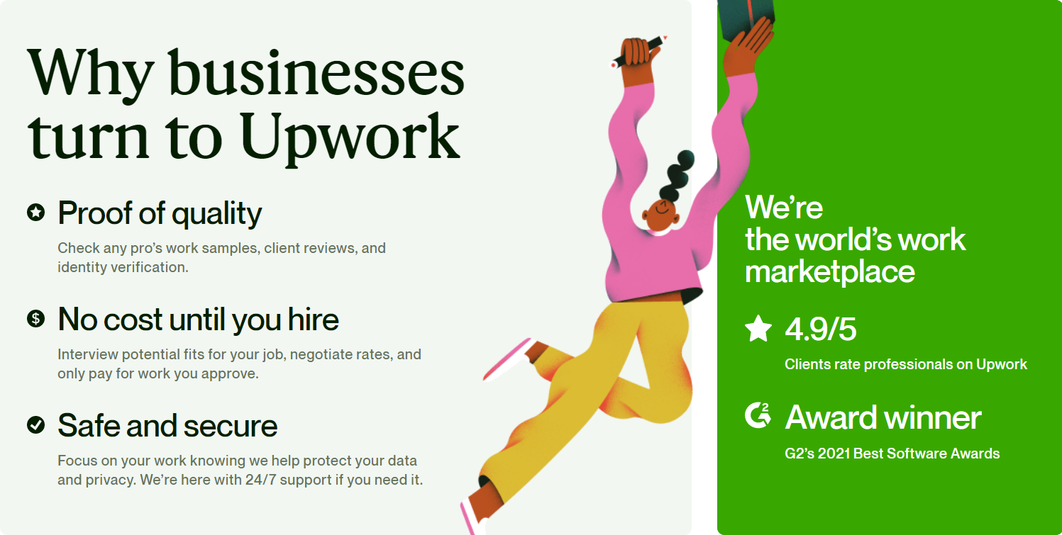
Highest priority (potential dealbreakers)
- How are freelancers vetted or verified?
- What are the basic costs?

High priority (could sway someone who's on the fence)
- Why would I use Upwork over another platform?
- Is there a satisfaction guarantee?

Moderate priority
- How do I connect with freelancers?
- What does the hiring process look like?

How might we answer high-priority questions to help prospective clients evaluate risks of trying Upwork?

Homepage vision
Our plan was to create a vision of a larger redesign which addresses the biggest issues from research, put it through usability testing, and take smaller steps towards that vision by testing individual components bit by bit.

I worked with the lead product designer to write content for these sections. Throughout the page we addressed some of the main notes from previous research, and included one section in particular that explicitly answered these key questions.

(This image is an incomplete representation of what we tested.)
Usability testing the vision
Our research team set up unmoderated tests with both clients and freelancers. While our team focused on the client experience, I advocated for including freelancers to make sure that we weren't inadvertently miscommunicating our product to that side of our user base or sending a message that their experience wasn't as important.

Some key takeaways from this
- Insights into terminology we used not only on the homepage, but throughout the site. (For example, how freelancers refer to themselves and how clients refer to the people they're hiring.)
- Confusion over the intent of a new component, which helped us take a step back to reconsider an experience we had been building out.
- Participants frequently said the "Why" section "answers the questions I have", and a majority listed it as the most critical information for choosing whether they wanted to sign up.
- While freelancers noticed that the value propositions were client-centric, they still found them useful. Similarly, clients found it useful to see information about the freelancer experience.

Other quotes and insights about the "Why" section
"This section is the most beautiful section. It provides integrity and quality."
"It does the best representation of why you would want to try Upwork, why it's safe."

There was some constructive criticism on one of the value propositions in particular, which read: "Data security and payment protection help you focus on the work that matters most." Some users considered it vague, which caused them to ask more questions, or worse, doubt the claims. It also wasn't clear what Upwork was actually doing here.

One thing I love about listening to unmoderated user testing is that sometimes you can actually hear an 'aha moment' happening in a person's voice. They read a piece of content out loud and understand a critical detail, which opens up other possibilities of how they might use the product. It's not something to expect, but it's always rewarding!
Testing on the homepage
As we planned next steps, we all agreed that a clear candidate for the first test on the way to the larger vision should be "Why Upwork".

- It had a great response in user testing.
- The design was finished and already fit with the current layout/style.
- It wasn't a change that disrupted the experience or required building out any additional steps.

On my end, I championed this in part because I identified it as a place to connect what I heard in user testing to actual business metrics. Content changes on their own aren’t always as easy to get buy-in for, especially on high-profile pages that constantly have other tests in motion.

So, we made some edits, mainly to the value prop around data security, and set up a test.

Hypothesis
By adding prominent value prop content that speaks to quality of talent, no upfront costs, and safety and security, we will improve visit to client registration because we know these are all key considerations for prospects when evaluating the risk of trying a new talent solution.

Primary metric: Client registrations
Two test cells: T1 had the component lower on the page, T2 placed it higher on the page

Results
- T2 saw a 6% lift in client registrations compared to the current homepage.
- T2 had better engagement with the page, including more scrolling on mobile (though primary metrics were flat on mobile).
- Both tests had a small but positive impact in secondary metrics (freelancer registrations and routing to other product offerings).
Next steps
- Default to the treatment with the component higher on the page (T2).
- Test the component higher on the page.
- Optimize for mobile.
- Use the component on other landing pages.
- Continue to iterate on value props.

Let's explore what content design can do for you

Thank you! I'll reply within 48 hours.
Sorry, it looks like something went wrong. Try sending your message again.